Start with the garment and the purpose
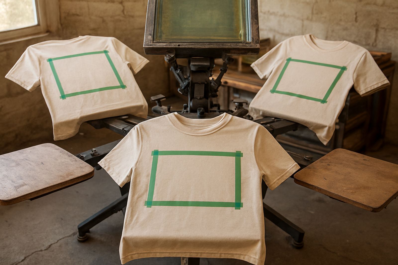
Before choosing a print position, look at the item itself. A t-shirt for a school function, a work shirt for site visits, and a sports vest for weekend matches all need different balance. The logo should sit where it can be seen without fighting seams, pockets, zips or stitching.
For businesses in Bloemfontein, Hamilton and the surrounding Free State towns, practical placement matters as much as style. A small chest logo works well on uniforms that need a neat, professional look, while a larger back print is better when staff must be spotted quickly at a gate, stall or event.
Think about the wearer too. If the shirt is for daily use, keep the print away from areas that rub under bags or aprons. If it is for one-off event wear, you can go bigger and bolder. Good placement helps the garment last longer and keeps the print looking balanced, even after regular washing.
Chest logos for clean, professional branding
Chest placement is still one of the most popular choices for uniforms and promotional apparel. A left chest logo gives a tidy appearance and leaves space for names, titles or small partner marks. It is a strong choice for clinics, security teams, office wear, school staff and service crews who want something simple and clear.
Chest prints work well when the artwork is compact. If the logo has fine details or small text, it may need to be simplified so it reads properly at about 8 to 10 cm wide. On darker shirts, colour matching becomes important so the print does not disappear in low light, especially for early-morning work or load-shedding conditions.
- Best for corporate uniforms and staff shirts
- Works well with name badges and embroidery if needed later
- Good for short messages, small marks and simple icons
- Leaves the back free for large sponsor details or contact information
Back prints for visibility at events and on site
A back print gives the most space and is often the first choice when the logo must be seen from a distance. This is useful for event crews, sports teams, school fundraising shirts and market stalls. It also helps when people need to identify staff quickly in busy places such as shows, outdoor functions or township activations.
The back is a practical spot for bigger artwork, but the placement needs careful sizing. A print that sits too high can look cramped under the collar, while one that is too low may be hidden by waistbands or bags. For most adult shirts, a centre-back print between the shoulder blades and the mid-back area works neatly.
In places like Welkom, Bethlehem and Kroonstad, where teams often work outdoors, a back print can carry a bold logo, a slogan or a sponsor line without needing extra decoration. It is a clear way to make a shirt useful and memorable at the same time.
Sleeve prints for smaller details and extra identity
Sleeve placement is a smart option when you want a second branding point without crowding the front. It suits schools, sports clubs, events and companies that want to add a small logo, department name or campaign message. A sleeve print is also useful when the front already has a large logo and you want the shirt to feel complete without overdoing it.
Short sleeve space is limited, so the artwork must be simple. On fitted shirts and work tops, the print should sit high enough to stay visible when the arm moves, but not so close to the cuff that it gets lost. On long-sleeve items, there may be room for a line of text or a slim vertical mark.
- Good for sponsor marks and department labels
- Useful on sportswear and staff shirts
- Keeps the main front print uncluttered
- Can help separate team roles at events or functions
Full-front prints when the logo needs to lead
Full-front placement is the strongest option when the design itself is the main message. It suits event shirts, promotional wear, youth camps and branded apparel for launches or giveaways. When the logo is large and has a solid shape, the front of the shirt becomes the main advertising space.
With full-front layouts, the size and positioning must take the neckline into account. A print that starts too high can crowd the collar, while one that is too low may look unfinished. The most balanced result usually sits squarely in the chest area and extends downward in a controlled way. For larger garments, that space can handle bold artwork nicely, but it should still leave breathing room around the edges.
For bulk orders across the Free State, full-front prints are often chosen because they are simple to coordinate. They work well on school event shirts, team tees and volunteer apparel, especially where a strong visual identity is needed across many sizes.
How to choose the right position for your order
The best placement depends on the goal of the shirt, the size run and how the item will be worn. A small logo on the chest may be ideal for office use, but a large event shirt may need the front and back used together. If the order includes mixed sizes, the artwork should be scaled so it stays readable on smaller garments and does not look oversized on larger ones.
For example, a school in Botshabelo sending shirts for a sports day may want a chest logo, a back team name and a sleeve year mark. A business in Hamilton might only need a neat left chest print for staff shirts. In both cases, artwork setup and size sorting make a real difference to the final result. The cleaner the file and the clearer the placement brief, the smoother the print run.
It also helps to think about practical wear. Light colours show bright prints well, while darker shirts need stronger contrast. On coastal orders or items stored in warm conditions, the ink and garment choice should suit the environment so the print stays sharp.
A simple checklist before the print run
Before any shirts go to print, it helps to check a few basics. This saves time, cuts down on rework and keeps the order looking consistent from the first shirt to the last. If you are ordering for a school, business or event, give clear instructions on where each logo should sit and which sizes need which layout.
- Confirm the print position: chest, back, sleeve or full front
- Approve the artwork size in millimetres or centimetres
- Check if names, numbers or department details are needed
- Decide whether the order needs individual bagging
- Make sure the final proof matches the intended garment colour
For clients in Bloemfontein, Thaba Nchu, Parys and beyond, couriered delivery makes it easy to get the finished stock wherever it is needed. A clear plan at the start means the shirts arrive ready to wear, with the logo placed where it should be and the job done properly.