
Start with the purpose of the garment
Before you choose colours, decide what the item must do. A work shirt for a warehouse in Hamilton is not the same as a fun run shirt for Parys or a matric trip tee for a school in Bloemfontein. The setting, the wearers and the type of message all influence the best base colour.
For staff uniforms, choose colours that support a neat, professional look and hide day to day wear. For event wear, think about visibility in crowds, easy sorting by team and how the garment will look in photos. For school apparel, durability and practicality matter just as much as appearance, especially when the garments are washed often and worn outdoors in the Free State sun.
Also consider where the clothing will be used. Light colours can show dust and marks more easily, while darker colours may feel warmer in direct sunlight. If the item will be worn during long shifts, sports training or outdoor functions, the colour should suit both the work and the weather.
- Workwear: choose practical shades that hide dust and handle regular washing.
- Events: use colours that help groups stand out and stay easy to spot.
- Schools: pick colours that feel tidy, age appropriate and durable.
- Retail or promotion: select shades that match the message you want people to remember.
Match garment colour to the print colour
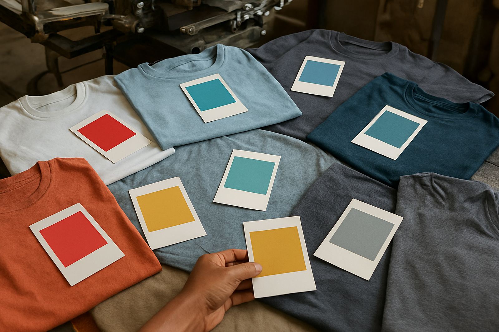
Good screen printing depends on contrast. If the print colour and garment colour are too close, the artwork may not stand out clearly. A white logo on navy, black on yellow, or red on grey can work well because the ink is easy to see from a distance. Pale print on a pale shirt, however, often loses impact.
Think about the number of colours in your design too. Simple one or two colour artwork is usually easier to read on more garment shades. Detailed artwork with fine lines, gradients or small text needs stronger contrast and more careful colour selection. If you want the logo to be sharp from across a hall or sports field, choose a garment colour that gives the print room to breathe.
We also check how the base colour affects the final tone of the print. Some darker fabrics can make ink appear slightly different, and some bright garments may need extra testing to keep colours true. That is why colour matching matters. A quick test on the right fabric can save a lot of disappointment later.
- High contrast works best for logos and names.
- Fine detail needs a clean background colour.
- Darker fabrics may change how some inks appear.
- Always check the sample on the actual garment type.
Choose shades that suit your audience
Your audience should influence the colour choice just as much as the logo does. A school ordering shirts for learners may prefer colours that are smart, age suitable and easy to keep neat. A trade company may want dependable shades like navy, charcoal or bottle green because they suit most staff and look professional in the field. An event organiser might go for brighter shades so teams can be identified quickly.
Think about who will wear the item every day and who will wear it only once. A shirt for repeat use should feel versatile and comfortable with trousers, skirts or shorts. A once off event shirt can be more playful, with stronger colours or higher visibility. If you are printing for mixed ages or different body types, a colour that flatters most people will usually get better wear.
For public facing roles, colour also affects perception. Calm, darker colours can suggest order and control, while brighter shades can feel lively and approachable. Neither is right or wrong. It depends on the image your organisation wants to project across Bloemfontein and beyond.
Consider light, heat and local conditions
In the Free State, colour choice is not only about style. Strong sunlight, dust, load-shedding and varying indoor lighting all play a part. Light garments stay cooler in hot weather, while darker garments can feel warmer if staff work outdoors for long periods. If the shirt will be worn in a yard, at a sporting venue or during distribution work, comfort should guide the colour choice.
Coastal humidity is not the main concern in Bloemfontein, but national orders often go to different climates. A colour that feels ideal in the dry interior may behave differently for clients near the coast, where damp air and frequent washing can affect the look of fabric over time. For couriered orders across South Africa, it helps to choose shades that stay reliable in different conditions.
Lighting also matters during load-shedding. A garment that looks one way under bright shop lighting can appear different in a dim office or evening venue. If exact colour is important, ask for a sample or a reference under natural light as well. That small step can prevent a costly reprint later on.
Build a simple colour checklist before ordering
A short checklist helps keep the order on track, especially for bulk printing. It is much easier to settle colour choices before artwork setup and size sorting begin. Once the job is in production, changing the garment shade can affect ink choice, print visibility and turnaround time.
- What is the item for: staff wear, school wear, sport or a once off event?
- Who will wear it and what age group is it for?
- Will the item be used indoors, outdoors or both?
- Does the chosen colour match your branding and existing garments?
- Will the print colour stand out clearly enough?
- Do you need a dark or light base for practical reasons?
- Have you checked the shade against the actual fabric type?
If you are unsure, start with one safe option. Navy, black, grey, white and maroon are common choices because they work well for many organisations. Bright colours can be effective too, but they should still suit the audience and purpose. The best choice is the one that looks good now and still makes sense after a season of wear.
When to keep it classic and when to go bold
Classic colours are often the right answer when the goal is consistency. They work well for uniforms, school apparel and repeat orders because they are easier to match later. If your team is expanding, a standard colour can help new staff or learners fit in without clashing with older stock. It also makes replenishment simpler when you need more garments later on.
Bold colours suit campaigns, launches and event shirts where attention matters. A bright garment can help your group stand out in a crowd and improve visibility in photos and videos. The key is to make sure the colour still supports the message. If the garment is too loud for the setting, the print can get lost. If it is too plain, the item may not feel special enough.
A good rule is to choose bold colour for short term impact and classic colour for long term use. If you are ordering for a school, business or club in Bloemfontein, Hamilton, Botshabelo, Thaba Nchu, Welkom, Bethlehem, Kroonstad or Parys, think about how long the garments must stay relevant. That will usually point you to the right shade.